One brand, ready
to leave the harbour.
Everything in this document is a direction to react to. Not a deliverable.
The Brief
One year in, Tallers works. The next step is scale: delivery, a second location, one brand that stays consistent everywhere.
The business
Fast-casual fried seafood. Rolls, cones, platters. Price point €4.5 to 15, counter + terrace. Open since 2025.
Why rebrand now
Today the storefront shows four logo versions and three taglines. Fine for one shop. Impossible to duplicate.
Audience
Young locals + tourists, Ciutat Vella. Price-aware, quality-driven. They find you on Instagram, TikTok and Glovo.
Personality
Fun, fresh, no fuss, a bit cheeky. Coastal, Mediterranean. Premium where it counts.
One system, built to travel
Squiddy already has the right instincts. We don't reinvent, we consolidate. Below: two graphic propositions, A and B, plus an open C. This whole page alternates between A and B every 3 seconds, so you can see both live. Three decisions carry the system:
① The mascot
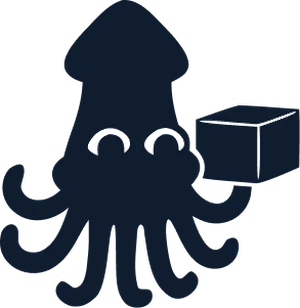
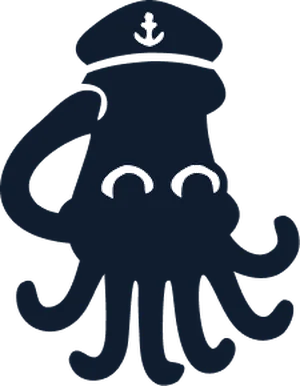
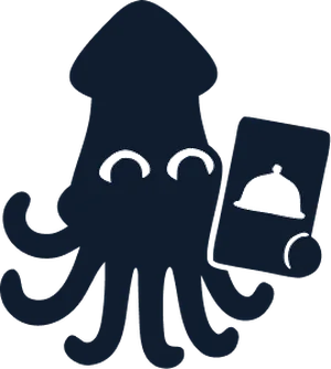
A character no one else can own. In A the eyes are the product itself: O, a calamari ring, and C, a bitten one, doubling as a wink. B trades them for two solid white eyes that punch through at any size. Whichever wins, the eyes are then locked: one official pose is the logo, a pose library does the rest.
② Blue & white, the ocean code
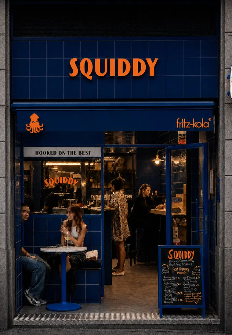
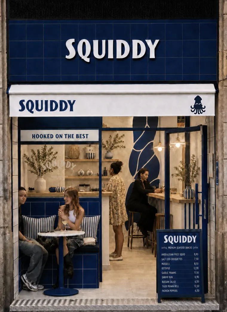
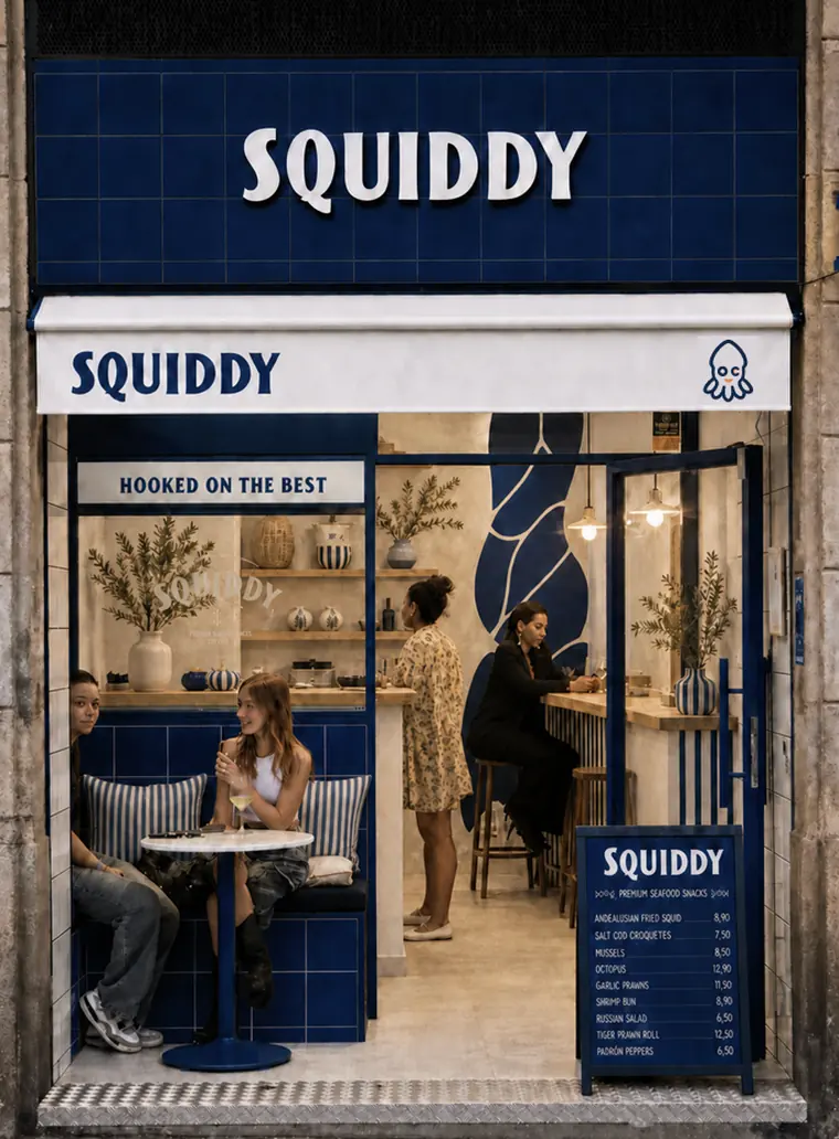
Navy #1D2B5F + white carry 90% of the identity. Orange #FF7E0D is the fried gold: max 10%, for prices and winks. A bolder inversion (blue #164498 with orange lettering) is shown on the storefront as a second colourway to react to.
③ The storefront as brand
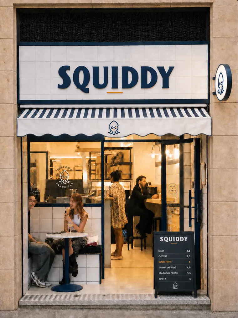
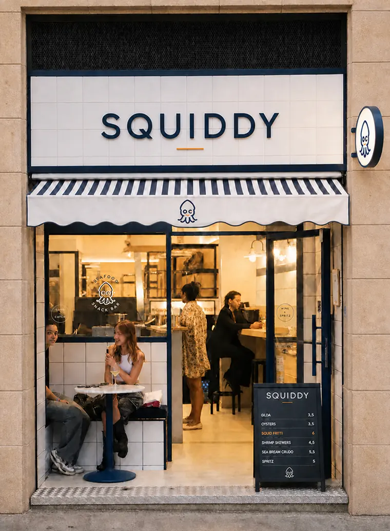
Tiles, stripes, round lightbox: the facade becomes a brand asset. Walk past the shop once, recognise the website forever. Every future storefront inherits the kit.
Line & wink
Outline drawing, O/C eyes, orange accents. Warm and detailed.
Silhouette
Solid mark, white eyes, one colour. Bold and instant.


Open direction
Not happy with A or B? We can go back to the drawing board and develop a third route tailored to your gut reaction.
Eight ways to wear it
Same brand, eight storefronts. We are here to advise and to push what we think is strongest, but the final direction has to be the one the founders actually love: a brand you own beats a brand you were sold. Swipe through, tell us which two speak to you, and we refine from there.
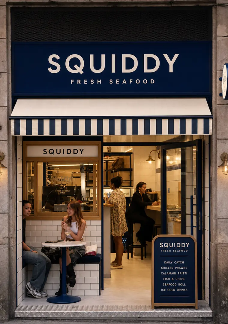
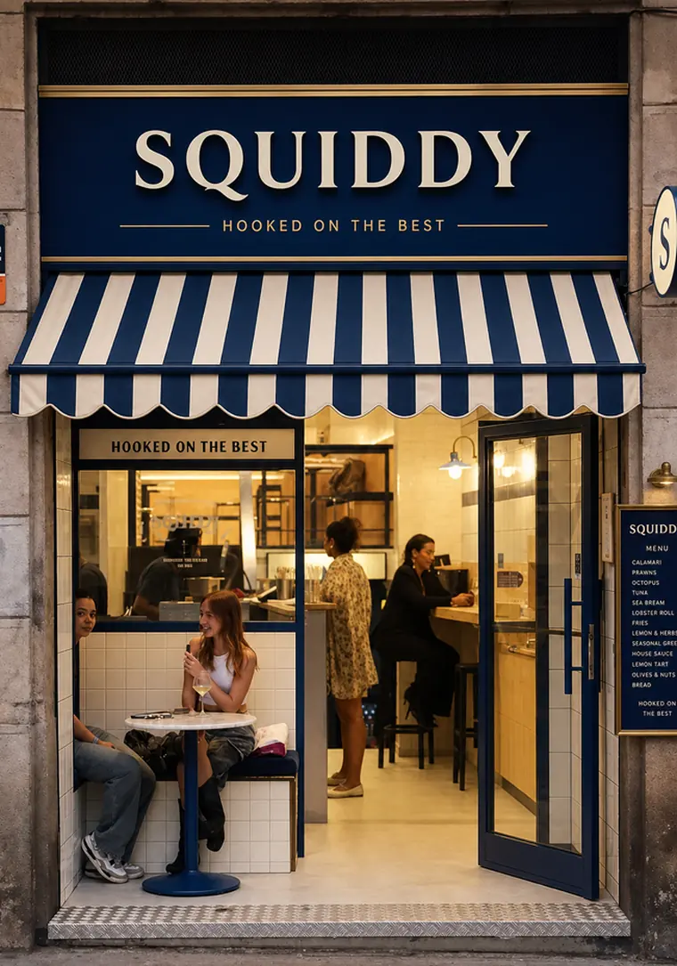
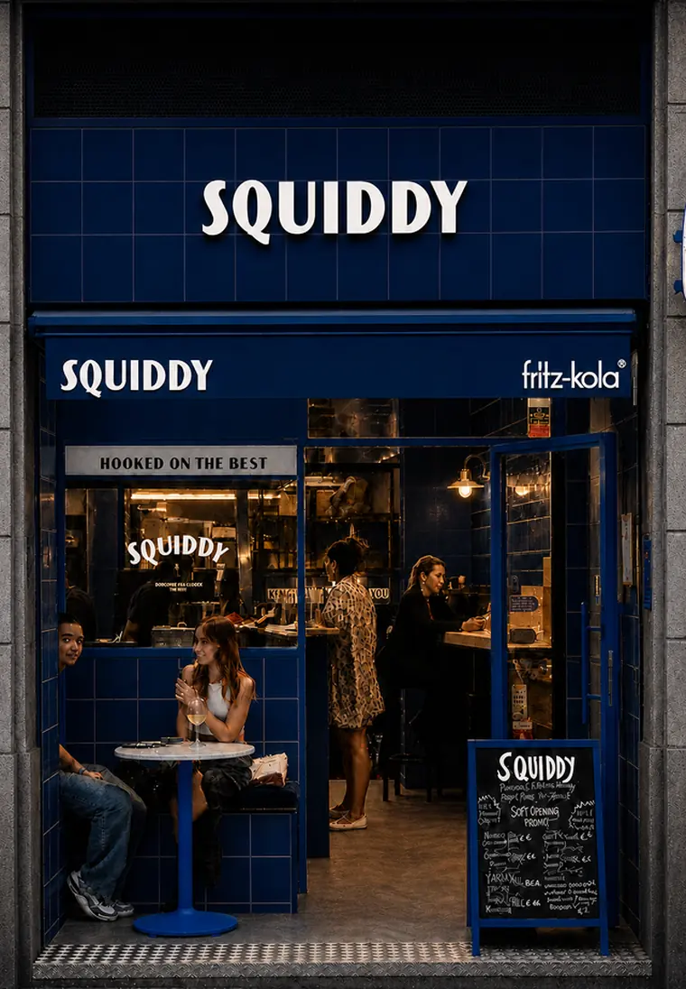
Barcelona today. Anywhere tomorrow.
Chosen to survive multiplication: new cities, new languages, new franchisees.
Fixed core, local freedom
Logo, eyes, navy/white, stripes: locked. Menus and local winks: free. Recognisable everywhere, generic nowhere.
Says what it sells
“Fresh seafood snacks” under the wordmark explains the brand where nobody knows the name. Madrid to Lisbon, no translation needed.
Delivery-first by design
Mascot legible at 20px, wordmark at 40px. Packaging built to arrive crunchy and get photographed.
A brand book, not just files
Every rule documented: usage, spacing, codes, do/don't. A second location can execute without us in the room.
What's included
The designs above illustrate the direction. Deliverables are produced after direction lock.
Brand colours
Palette, ratios, print + digital codes, accessibility checks.
Brand fonts
Display + text system, hierarchy rules, free licensing.
Packaging
Boxes, cones, carry-bags. Print-ready, pattern + mascot.
Menu design
Counter board, printed menu and delivery-app listings. One hierarchy, three formats.
Branded napkins
Print-ready napkin design in the brand pattern.
Business card
Two-sided card, print-ready.
Stickers
Sheet from the pose library: seals + giveaways.
Website
One-page site: menu, ordering, story, locations. Mobile-first, delivery-ready.
Logo
Wordmark + mascot as autonomous mark + pose library.
Brand book
The rulebook that makes it all duplicable, city after city.
One price, everything above
- All 10 deliverables, print-ready and web-ready
- Two structured revision rounds per deliverable
- Source files handed over (SVG, print PDFs, web assets)
- 30-minute handover session with your team
Five weeks, door to door
Direction lock: mascot vectors, palette, type. One call.
Roll-out: packaging, menus, napkins, cards, stickers.
Website build & content, delivery-platform assets.
Brand book, source files, handover.
Ready when you are.
One reply locks the start date. Talk straight to the NODS team.
Message us on WhatsApp